UI/UX Crimes: Case Study 2
Galaxus Website - Landing Page
Victim Profile
As a resident in Switzerland I don't have access to Amazon domestically. Our local alternative is Galaxus and functions similarly - will happily sell you everything but the kitchen sink (and sometimes even the sink is on offer). However, Galaxus also features a digital magazine with a vast collection of regularly updated articles about upcoming/current products as well as opinion pieces regarding social trends. The landing page of the website is a mishmash of product promotions and the afore mentioned articles, as well as the more traditional product category navigations and a universal search.

As with a lot of such platforms, the website is not flawless, however in the case of Galaxus there are some rather questionable choices and some obvious implementation mistakes. Lets take a closer look.
Forensic Evidence
Using the screenshot above, and the ones contained within this section, as a reference lets go over the issues I've identified:
-
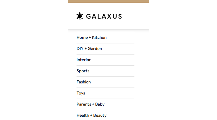
Problematic Layout: While inspecting the HTML of this page it became clear that the header is not a separate fixed-position element but rather part of the main body, which is why the scrollbar encompasses it even though it never scroll with the rest of the content
-
CSS Property Overlap: A side effect of the afore mentioned bad layout, the navigation menu on the left requires artificial top-padding to remain below the header. This breaks when the user scrolls resulting in the first entry of the navigation menu disappearing behind the header
-
Wasted Screen Real Estate: Upon first loading into this page the site has all right-hand side menus collapsed, but rather than expanding the main content to take up the available space, it leaves a large empty section
-
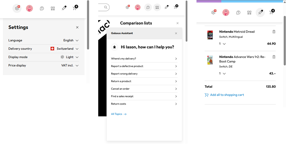
Inconsistent Styling: Speaking of right-hand side menus, the elements populated appear to follow no universal standards - some are injected in the main layout, others modals, and at times they even overlap making them unusable
Investigation Outcome
This is how I would address the issues listed above:
-
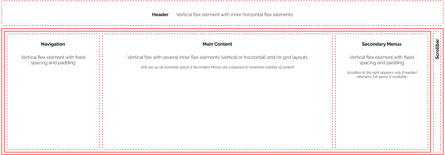
Below is a wireframe of the new layout in order to isolate all the different sections and ensure they don't interfere with each other. The header is now a separate element that has no scrollable overflow and is fixed in position
-
The navigation menu sits inside the lower section so no longer needs to artificially position itself below the header
-
The right-hand side menus now sit in a separate column that collapses to 0 width when none are active, thus making space for the main body to stretch to the end of the screen

-
The right-hand side menus have all been restyled for consistency, and the ability to stack them on top of each other has been introduced, thus giving the user the ability to see multiple menus at the same time