UI/UX Crimes: Case Study 1
MacOS Tahoe v26.0.1 Emoticon Menu
Introduction to the Series
Since this is my first entry into this series of posts, I feel it's important to clarify my goal here.
As an individual with sevelar years of experience in the industry, I have developed a sharp eye for pain points in interfaces. As such, I often find myself contemplating solutions to issues I've encounter in apps and tools I use regularly. My aim isn't to shame the creatives behind these products, but rather to explore how I would tackle them.
In some cases I will consider full redesigns if I feel it's called for, while in others I will simply refine the existing solution as needed. This is by no means a comprehensive collection of such issues I've encountered, but rather a randomly selected sample of them.
With that out of the way, lets get started with my first victim courtesy of Apple itself; a company that in many ways established the majority of modern UI/UX standards we now take for granted.
Victim Profile
Anyone who uses a Macbook should be familiar with the Emoticon Menu that pops up when you press the Function (Fn) key on your keyboard. This has been a staple feature of macOS for a while and in general utilises the same aesthetic as every other window across the OS.
That said, I noticed that the most recent iteration of this menu has deviated substantially from the aesthetic of other apps. I'm not certain if this is simply an oversight, or badly coded styling, however it has resulted in quite a flawed result that I find rather unusable.
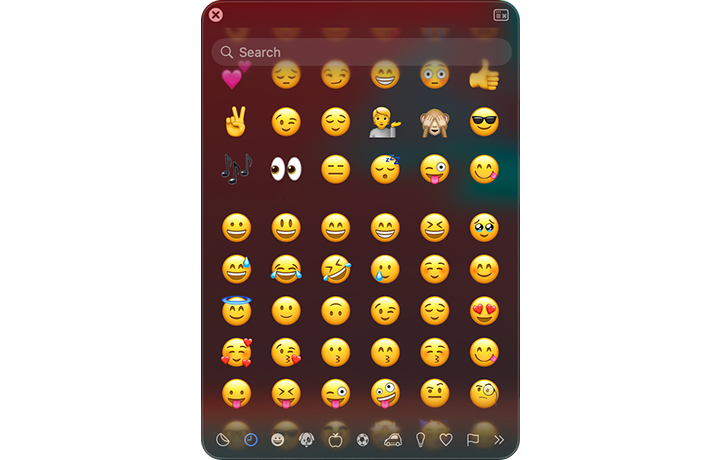
Forensic Evidence
Using the screenshot above as a reference lets go over the issues I've identified:
- Inconsistent Styling: The padding between the header and footer of the window appears inconsistent making it look like elements are too close to the window edge in the header versus the footer
- Reduced Readability: Once the user starts scrolling the emoticons position themselves behind the semi-transparent search field making it much harder to read anything the user has or is typing
- Non-Uniformity of Category Icons: Looking at the category icons in the footer I can see no reason why some of them are solid while others are outlines - in my opinion these should be consistent unless the solid nature actually signifies a visual difference
- Non-Uniformity of Generic Window Elements: Comparing this window to other macOS windows it becomes obvious that they have used a different "Close" icon for no apparent reason
- Inconsistent Transparency: The emoticons are visible all the way to the bottom of the window (even behind the category icons) however cut off sharply just below the header
Investigation Outcome
This is how I would address the issues listed above:
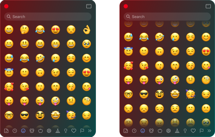
- The header has been given padding more consistent with the footer, thus giving the window more uniform styling
- The emoticons no longer scroll behind the search bar and instead fade out just before reaching it. This maintains readability regardless of how far the user scrolls
- Category icons have been adjusted (icons used are from Lucide) for a more consistent aesthetic
- The "Close" button has been replaced with the more standardized red dot used everywhere else in the OS
- I've intentionally restricted the emoticons from scrolling past the body of the window that way they never overlap with either the header or the footer. As a result the body content never sharply cuts off regardless of overflow direction*
*Note: I've maintained the edge fade in either direction of the scroll when an overflow is present as this helps the user understand that there is more content and they can scroll.